
Doombar: A Dashboard for the Monitor Under My Monitor
I turned a 2560×666 touchscreen strip into a glanceable dashboard for Slack, email and my calendar, so my main screen stays clear. What it does and how it was built.
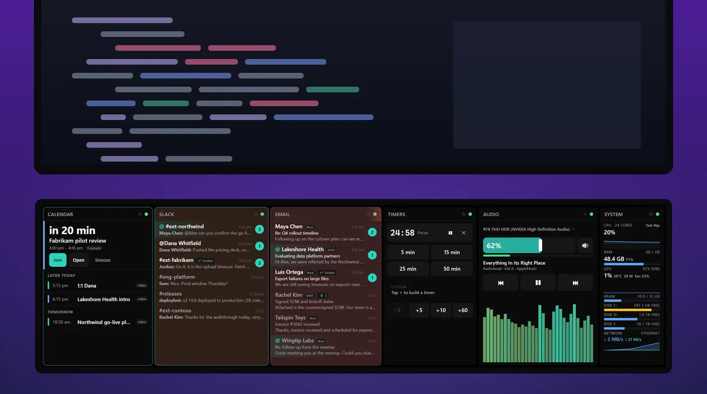
I recently added a 2560×666 touchscreen strip to my Windows workstation. It's a strange shape, nearly four times as wide as it is tall, and nothing I normally run looks right on it. A browser window is all chrome and no page. The taskbar wastes it. So I decided the strip would run exactly one program, full screen, and I'd write that program myself. That program is Doombar.
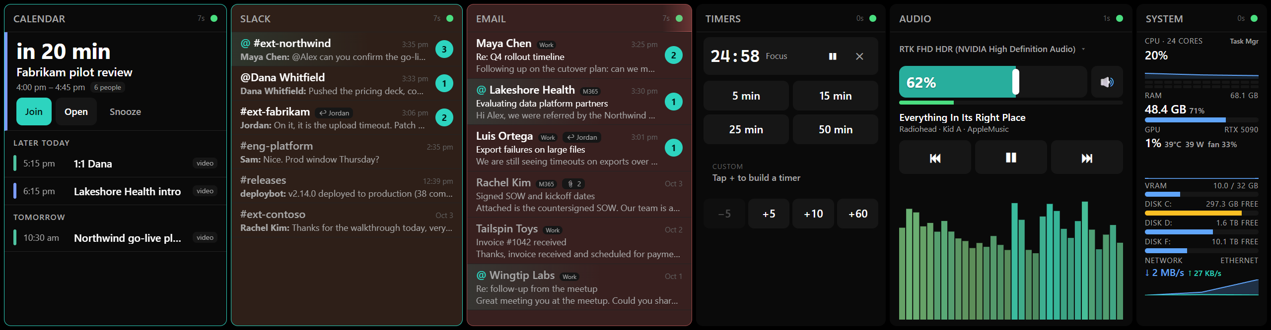
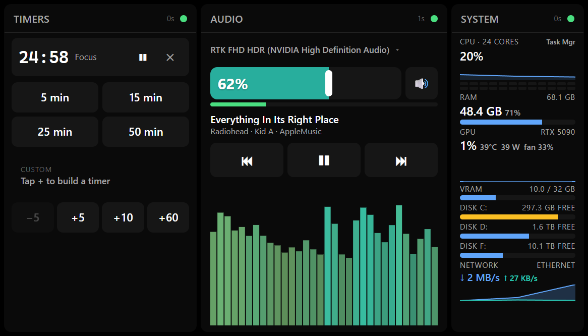
The whole strip. Tap the image to open it full size. All screenshots use made-up data.
Code: github.com/alradulo/doombar
As for the name: it's just fun. I may yet make it run Doom.
Why I wrote it
I needed a way to keep track of the important stuff while keeping my main screen clear. Client messages, email from prospects and the next meeting all matter, but I don't want Slack and two inboxes open next to my code all day, and I don't want to keep switching windows to check them.
Doombar puts all of that on the strip. At a glance I can see whether anything important is waiting. I don't even need to look straight at it: from the corner of my eye I can tell whether a panel has gone amber or red, and only then do I look closer. If the strip is calm, nothing needs me and I keep working. It makes my day a lot easier.
That led to a few hard requirements:
- Peripheral, not interactive. Large type, high contrast, and state changes you notice without looking straight at them: a panel changing color, not a small badge.
- Filtered. Only the Slack channels I care about. Only email from current clients and prospects. Everything else stays in the real apps.
- Light. The same machine runs ComfyUI and local models on a 5090. The dashboard has to stay small and close to idle.
- Touch-first. The strip is a touchscreen, so nothing can depend on hover, and nothing destructive can happen from one accidental tap.
Nothing off the shelf fit the shape of the screen or the filtering I wanted, so I wrote a spec and built it.
How it was built
I started with a design document rather than code. ultrawide.md in the repo lays out the layout, the touch rules, the requirements for each panel, the architecture and the build order. I handed that to Claude Code and worked through it panel by panel, using the dashboard daily as each piece landed. Where the build departed from the spec (SQLite through Node's built-in node:sqlite instead of better-sqlite3, Slack's Socket Mode client directly instead of Bolt, multiple mail accounts instead of one), the README records the change and the reason.
Writing the spec first paid off. Decisions like "no process kill button on a touch strip" and "timers are built from chips, not a numpad" were settled before any code existed, so they didn't have to be argued again later.
What it offers
The strip is divided into columns, six by default.
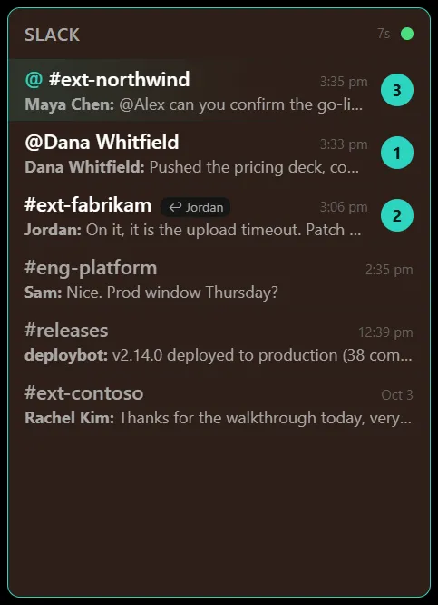
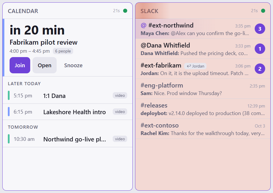
Slack. Watches a configured list of channels and DMs over Socket Mode, so updates are live with no polling and no public URL. Each channel shows its unread count and newest message, @mentions are highlighted, and a swipe marks the channel read. For channels shared with customers, it knows when someone on my team has already replied after the customer's last message and stops alerting on that channel.

Calendar. Merges any number of Google and Microsoft 365 calendars onto one timeline, with per-calendar colors. The next meeting gets the most space and a countdown, and the join link is one tap. Duplicate invites that land on two calendars show once.
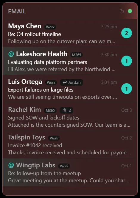
Email. Only mail from domains on my client and prospect list, grouped by client, across Gmail and Outlook accounts at once. Mark read and archive work from the strip, and they apply to every copy if the same message reached two accounts. Any message can get a short summary from the Claude API on request, and long messages from prospects are summarized automatically. The summary covers what the sender wants, any deadline, and what they're asking me to do. Calendar RSVPs are listed but never count as unread, and a thread a teammate has already answered stops counting too.
Timers. One-tap presets, plus +5 / +10 / +60 chips to build a custom duration or extend a running timer. Timers survive a restart because end times are stored, not remaining seconds.
Audio. Master volume, mute, play/pause and skip, the same calls the keyboard media keys make. Tap the device name to switch the default output. It shows a peak meter, now-playing information from the Windows media session, and either a spectrum or the album art. Tap the header and the panel flips over to a player for the music I generate with ACE-Step, with like, dislike and "broken" controls on global hotkeys.
System. CPU, RAM, GPU utilization and temperature via nvidia-smi, disk and network. Thresholds turn values amber or red. Task Manager is one tap away; there is deliberately no way to kill a process from the strip.
Attention that escalates
The feature I rely on most is the unread tint. When something unread arrives in Slack or email, that panel warms to amber. If it's still unread after 30 minutes it turns red, and after an hour it starts to breathe slowly between two reds. A soft sweep crosses the panel header when new items arrive and repeats as a reminder. Reading everything clears it. Ctrl+Alt+S snoozes all of it for half an hour when I need to concentrate.
Amber means something new has arrived. Red means I've let it sit.
In the strip at the top, Slack is amber with a fresh @mention and Email has gone red. A tap on a header switches that panel to its focus view, which keeps only what needs me:
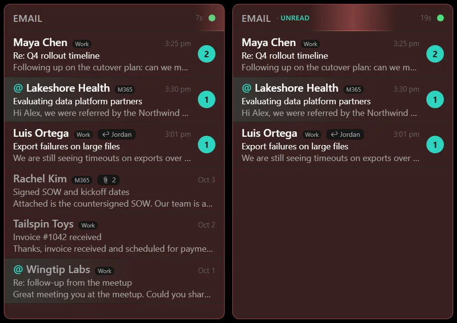
Email in the normal view (left) and the focus view (right).
Built to live on a strip
-
Layout editing by touch. Long-press a panel header to unlock the layout, drag to reorder, drag the gaps to resize. The result is saved to the same
config.jsonI can edit by hand, and that file is hot-reloaded. -
Panel views. A short tap on a header cycles through normal, focus (only what's unread or next) and more (the longer history). The panel flips like a card when it changes.
-
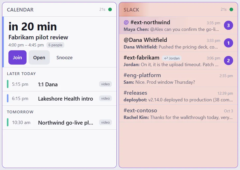
Themes. Six palettes, four dark and two light. On Auto, it follows Windows light/dark mode.
-
Display schedule. During business hours it keeps the strip awake and blanks it after 30 minutes idle. Outside business hours it follows Windows power settings and dims. A tap wakes it without triggering whatever was under your finger.
-
Mouse fence. The physical mouse can't wander onto the strip; it slides along the edge instead. Touch still works, which keeps the strip from eating cursor movements meant for the main monitor.
-
Watchdog. The installed build runs under a small supervisor that restarts the dashboard if it crashes or hangs, backs off if it keeps failing, and stays out of the way during Windows shutdown.
Under the hood
Doombar is an Electron app in plain JavaScript, about 7,000 lines. Every integration is a service in the main process with the same shape: start, stop, getState, and a list of actions. Each panel in the renderer subscribes to one service over IPC. The preload bridge exposes exactly two functions, subscribe and action. Adding a panel means one service file, one panel file and a line in the layout config.
Each service also runs on its own from the command line (node services/slack.js --dump) and prints its state as JSON, which makes debugging an integration possible without launching the window.
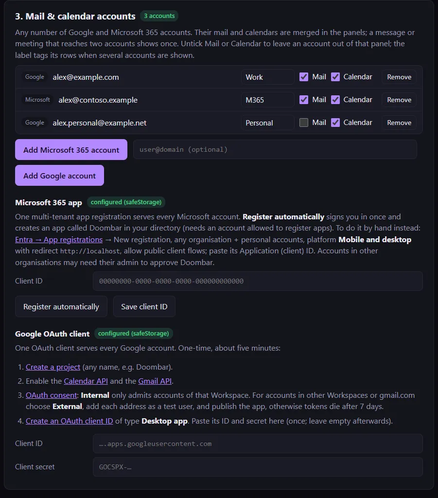
Secrets (Slack tokens, OAuth refresh tokens, the Claude API key) are encrypted with Electron's safeStorage and never written in plain text. Email bodies and message contents are never logged. Microsoft 365 sign-in uses authorization code with PKCE and needs no client secret. A setup window handles tokens, accounts, channels, the client list and theme, and tests each credential before saving it.
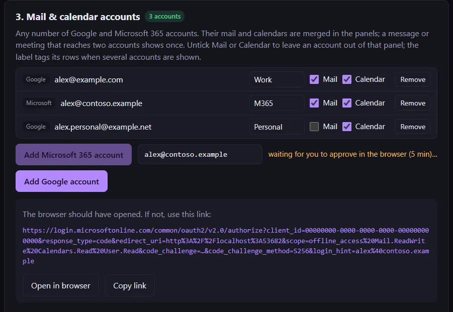
Adding an account opens the provider's consent page in the browser; the window waits and shows the link in case the browser didn't open:
Running it
It's built for one machine and one oddly shaped monitor, so expect some setup: a Slack app (a manifest is included), a Google OAuth client, and optionally a Microsoft Entra app registration, which the setup tool can create for you. npm start finds a 2560×666 display and takes it over in kiosk mode. If there isn't one, it opens as a regular window. npm run dist builds a portable Windows app, and npm run deploy installs it as a login item.
If you have one of these strip monitors, or a spare screen you'd like to turn into something you glance at instead of something you check, take a look. The spec in ultrawide.md is worth reading on its own if you're planning something similar.
Keywords
Related Articles
We Spent Days Fighting a Zebra Card Printer. So You Don't Have To.
Frustrated with Zebra ZC350 card printer integration? Dazzle, an open-source bridge, saves you time ...
We Automated Our Product Walkthrough Video. The Whole Thing.
Stop manually recording product demos. Learn how to use Playwright, ElevenLabs, and FFmpeg to automa...
Two Lines of Code That Fix Logging Spaghetti in Real JavaScript Systems
Tired of unreadable logs? Fix JavaScript logging spaghetti with just two lines of code! Add context ...